For over 60 years, FAET has been synonymous with innovation, reliability, and energy serving the electrotechnical industry. Today, this spirit of evolution is also reflected in our image: we’ve embarked on a rebranding journey to consistently and visually convey who we are and where we’re headed.
The new logo was born from the need to adapt to a constantly changing world, where communication is increasingly digital, instant, and visual. That’s why we’ve chosen a more modern, recognizable, and versatile visual identity.
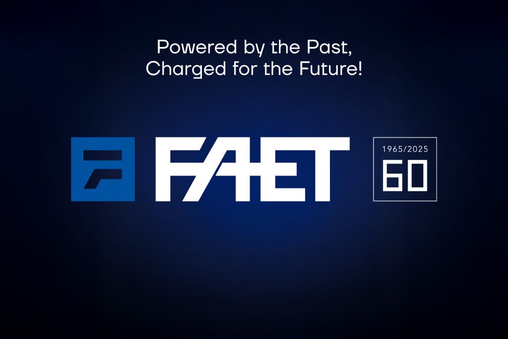
For the first time, the brand introduces a distinctive symbol: a stylized “F” that recalls the geometry of the historic logo but simplifies its lines, making it suitable for any format and context, including digital. The lettering has been redesigned to be more open, legible, and dynamic—even at smaller sizes.
Energy, a core part of our DNA, now finds a new expression: an abstract graphic element inspired by an electric discharge, which runs through and energizes the entire design, visually representing our role in the industry.
This restyling is not just a change of image but a statement of intent: FAET continues to look ahead, true to its roots but with its eyes firmly set on the future.
Discover the new logo and let our energy guide you.